Manus Products: Making Manufacturing Look Good

Website Redesign / Information Architecture / Forms UX / Product Image Retouching

Thumbnail
Thumbnail

Tools:

Figma / Photoshop / Illustrator / CMS

Client:

Manus Products

A Strong Brand Held Back by a Weak Site

When I started working with Manus Products, their site was cluttered, outdated, and surprisingly hard to navigate — especially for a company that creates high-performance sealants and adhesives used across major industries. The product information was buried, the structure was unclear, and the visual design didn't reflect the innovation or professionalism of the brand.

Their digital presence wasn’t just lagging — it was limiting.

img
img
img
img

Getting Creative with Insights

Because I didn’t have direct access to customers for interviews, I leaned on competitor research and internal conversations. I asked the Manus team strategic questions to surface pain points, learn how their customers think, and uncover where the current site fell short.

That gave me the foundation I needed to move forward with user-centered design decisions — even without firsthand user quotes.

img
img

Respecting the Brand, Evolving the Feel

Manus had a brand — and it worked. What it needed was refinement. I kept their core look intact but gave it a modern upgrade. Think: more clarity, more space, and a sharper visual hierarchy. The goal was to present them as the premium, trusted manufacturer they are — without overhauling their identity.

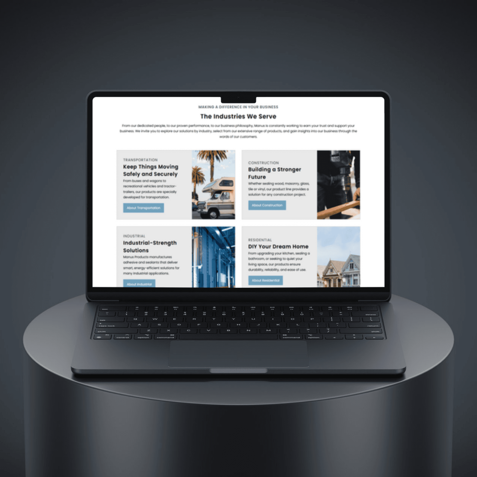
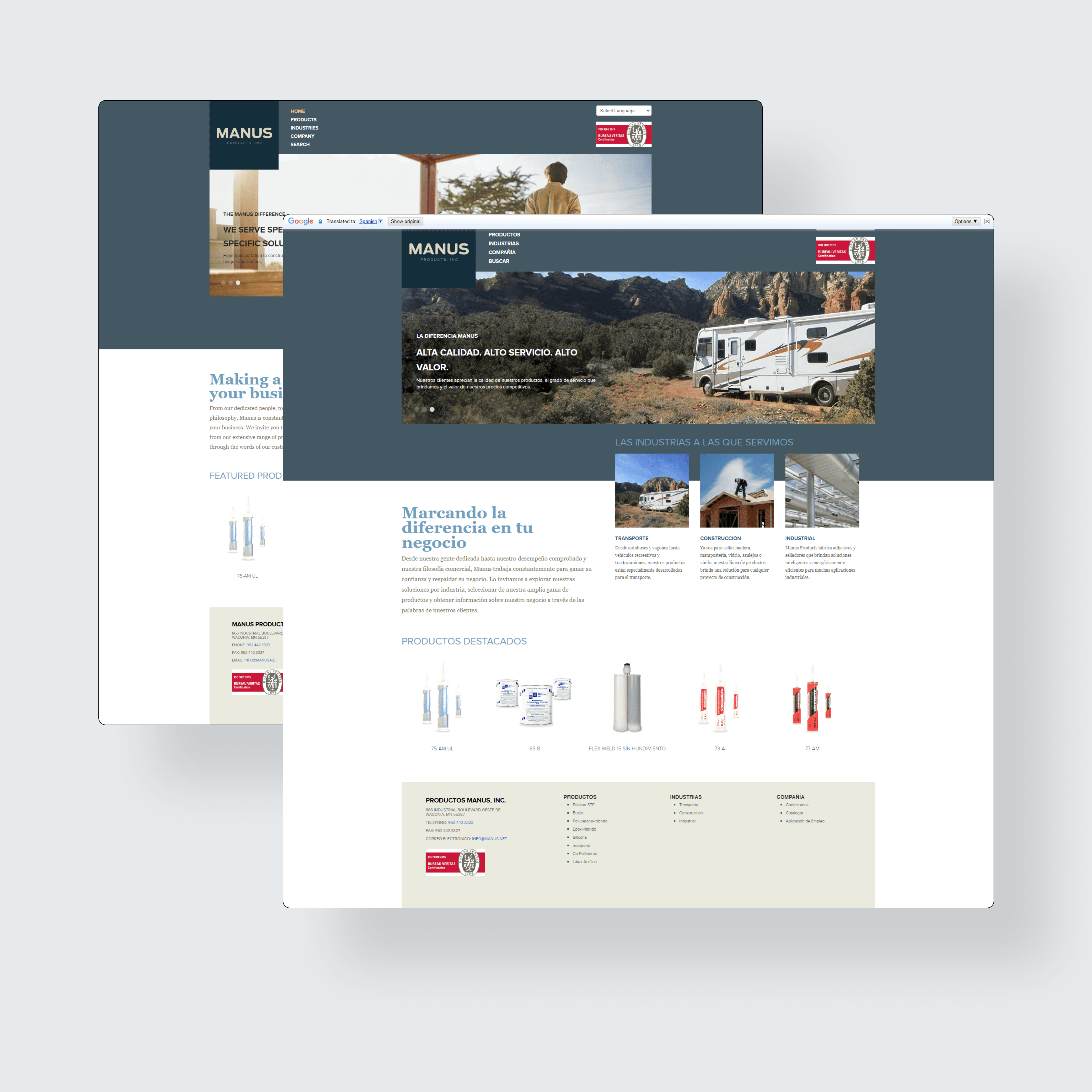
Rebuilding the Structure

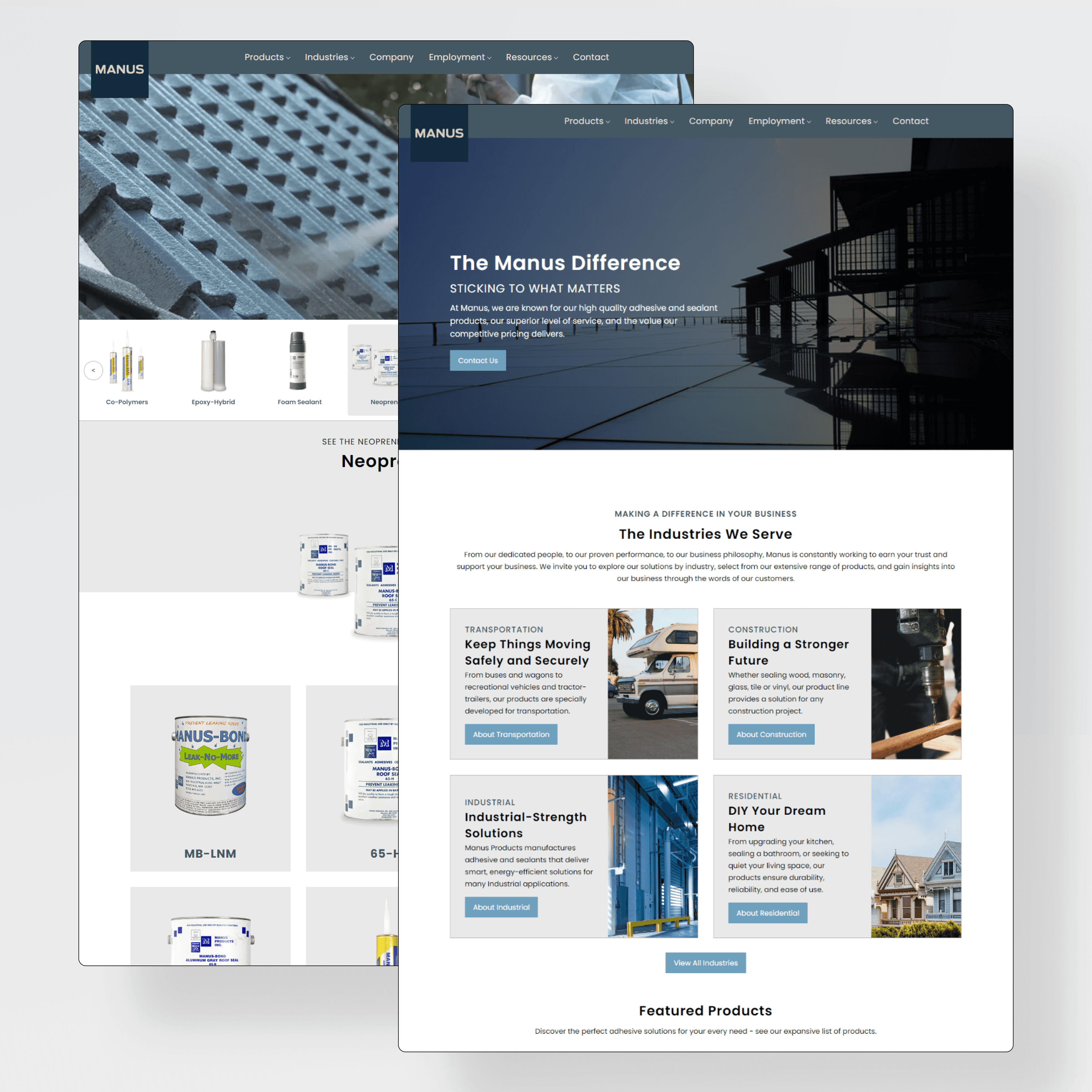
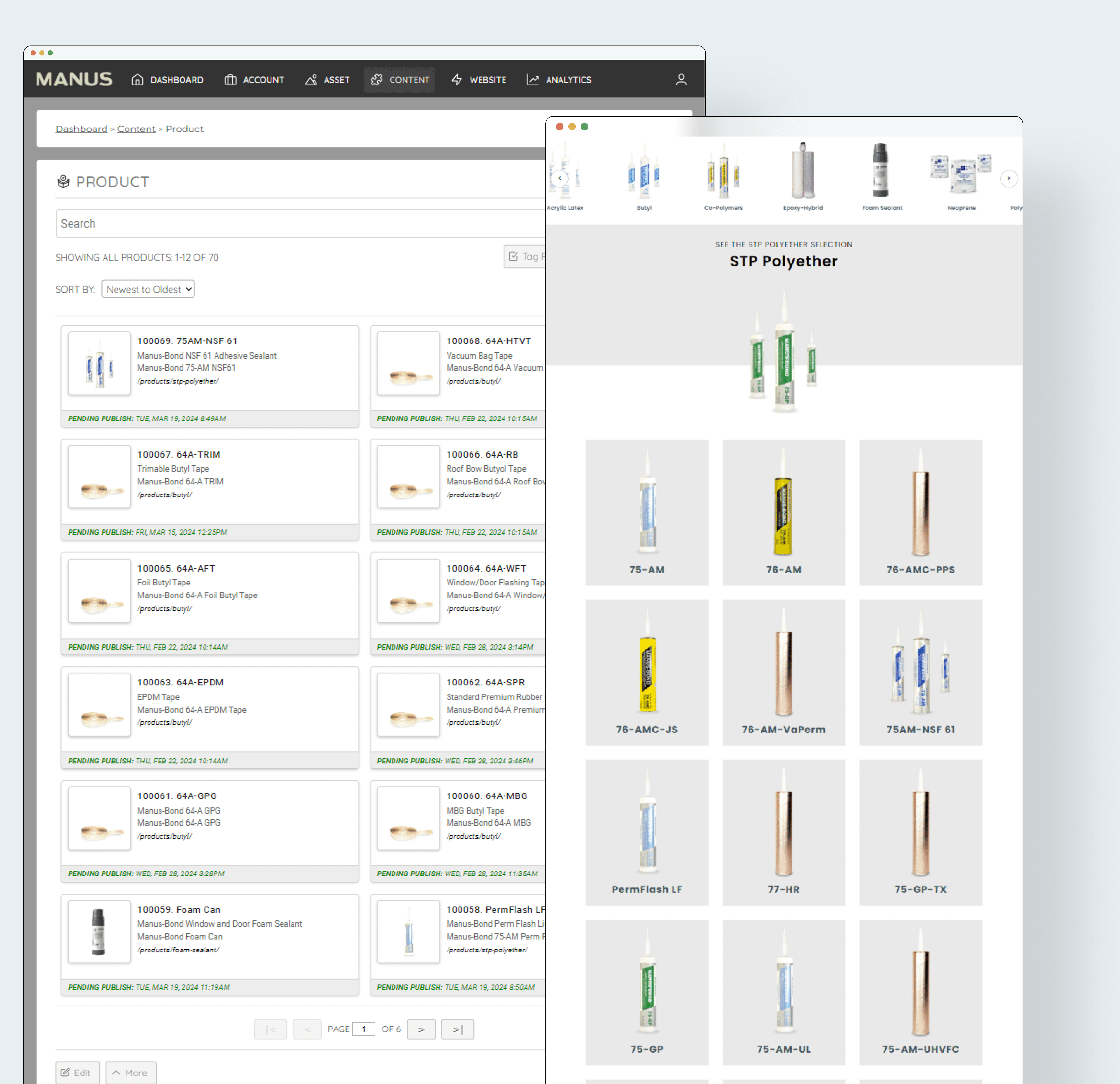
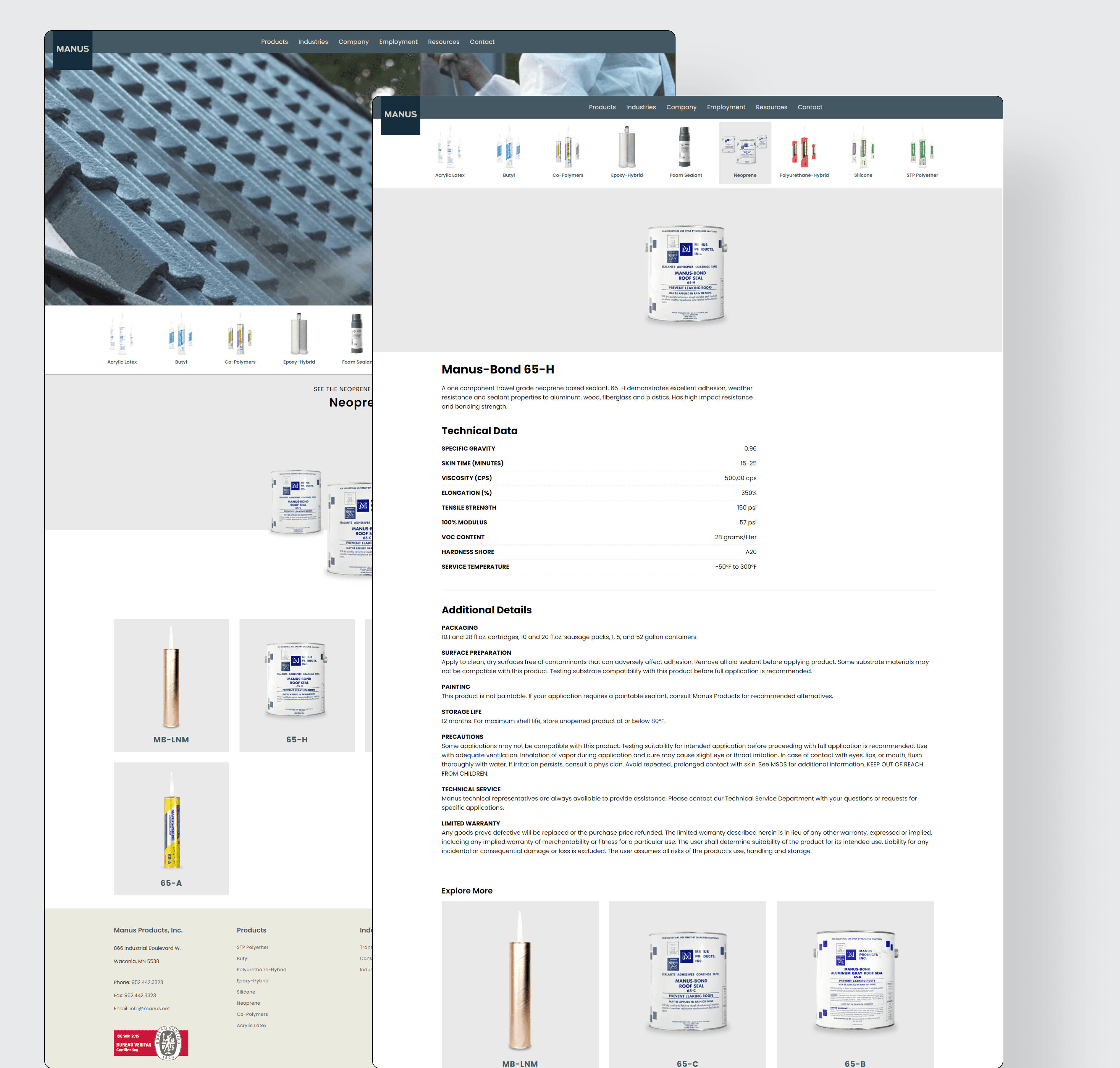
I started with low-fidelity wireframes to map out key sections and user flows. One of the biggest challenges was the Information Architecture — Manus has a large number of products with technical data, and customers need to find what they’re looking for quickly. I worked closely with development to plan out how content would be surfaced logically and intuitively.

But clean navigation only goes so far without clear visuals. Many products had no usable product photography, so I stepped in — photoshopping product images from scratch using supplied packaging references. The goal was consistency, accuracy, and giving each product a visual identity users could connect with.

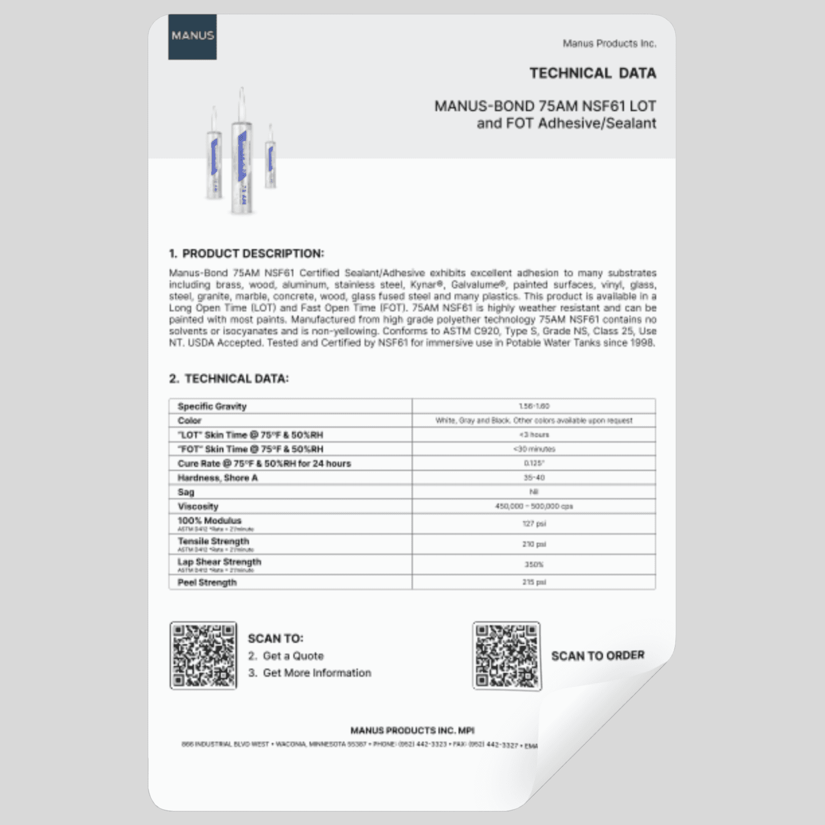
I also designed a new Technical Datasheet template — clean, branded, and easy to scan — to replace outdated PDFs and improve the customer experience from download to print. These assets not only elevated the site visually but added real value for dealers, customers, and internal teams.

Once the structure and assets were in place, I moved into high-fidelity UI — applying modern design heuristics and principles — and presented the system to the Manus team. Once approved, we were ready to build.

Development & CMS Implementation

The site was built using the KNVEY CMS platform. My role in development focused on quality assurance, CSS refinement for pixel-perfect design, and migrating large amounts of content from the previous website into the new structure.

I worked closely with the dev team to make sure what we launched matched the designs — not just visually, but experientially.

I also created instructional documentation to handoff to the Manus team so that they could make changes to their products within their new CMS.

A Site That Works as Hard as the Products

  • More product inquiries thanks to simplified navigation and stronger content hierarchy

  • Higher traffic and lower bounce rates, driven by better SEO and a cleaner mobile experience

  • Positive feedback from the Manus team, who now feel proud of the site and are already planning future digital projects based on the success of this one

Reflection: What This Project Reinforced for Me

Sometimes the challenge isn’t to reinvent the brand — it’s to reveal it. This project reminded me how good UX isn’t always flashy. It’s about listening closely, designing for clarity, and building tools that make life easier for the user and the business. And when that’s done well? Even the most technical site can feel effortless.

Need a designer who gets it? I’m here for that.

Connect on Social

icon
icon
Logo

I'm a UX designer and creative strategist who blends research, design, and development to bring ideas to life. I partner with brands of all sizes — from startups to enterprise — to craft thoughtful, user-centered solutions that drive results.

Logo

Copyright and design by Aaron Knutson- 2025